Are you designing a website for a nonprofit? You’re in for an exciting ride!
There is essentially no difference between designing for impact, or social good, and for profitable endeavors. You are selling something for both: an advocacy or a product/service. You aim to increase traffic to your website, persuade visitors to check your pages, and boost your conversions. Designing for a nonprofit, however, can be a bit trickier. You will be encouraging people to donate money, time or other resources without anything tangible in return.
What are you designing for?
Before going over design tips for nonprofits, you should first set your conversion goals. These will guide you in choosing the right design elements. A conversion goal is the result you want for your web pages. For nonprofits, conversion goals may be:
to increase awareness
to boost email/newsletter subscribers
to entice volunteerism
to increase donations
to encourage engagement via online communities and social media
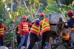
To increase awareness of your advocacy, you may use high-quality photo showing your nonprofit at work – working with volunteers or beneficiaries. To boost your email subscribers, you may add calls-to-action in your content. By clearly setting conversion goals, you will be able to plan your website design and optimization strategies well.
Roll up your sleeves and start planning with these design rules.
Your design must focus on the good
It is important to let people know about the problems your nonprofit aims to solve. But to get them involved, you should focus on how you are working to address these problems. Donors and volunteers will be more encouraged to share your advocacy if your website highlights the positive impact of your organization.
Here are some examples:
Your design should be empathetic

Graphic design for nonprofits should put the social good first, and aesthetic, second. Plan an empathetic design.
An emphatic design is one created a “deep understanding of the problems and realities of the people you are designing for,” according to IDEO’s Human-Centred Design Toolkit. Observe, engage and empathize with the people you are designing for to better understand their motivations, desires and needs. Immerse yourself in their environment to have a deeper knowledge of the issues and challenges involved.
“Design has the power to shift people’s perspective and opinion. Take it seriously and honor the people and message you are serving, the goals of the organization and the experience you want the viewer to have,” said Justin Ahrens, founder of creative agency Rule29.
Your design must be real (use real photos)

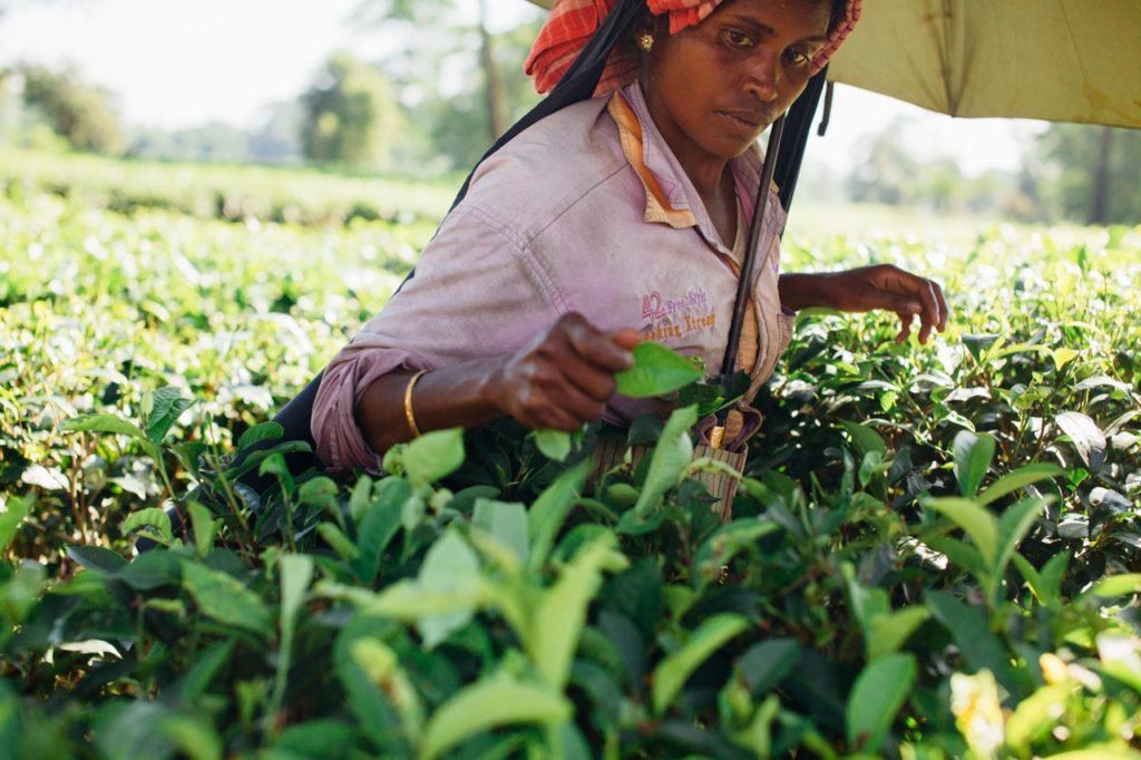
Imagery is an essential design element for websites. It interprets your content and puts a human touch to your design. A photo can show a problem and a solution in a single shot.
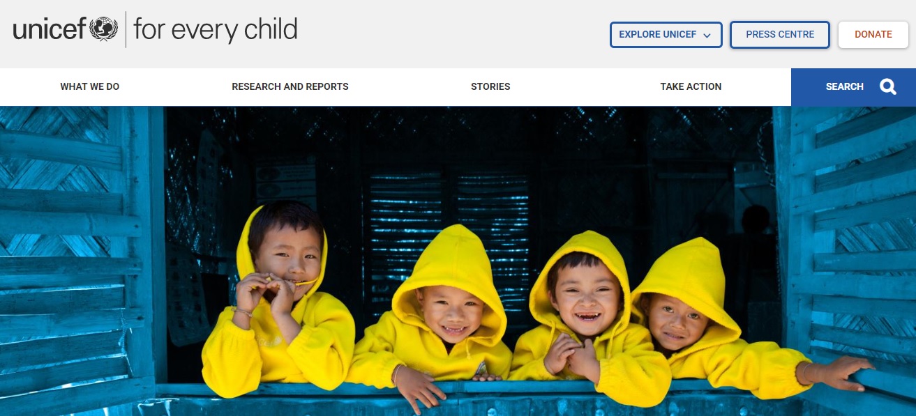
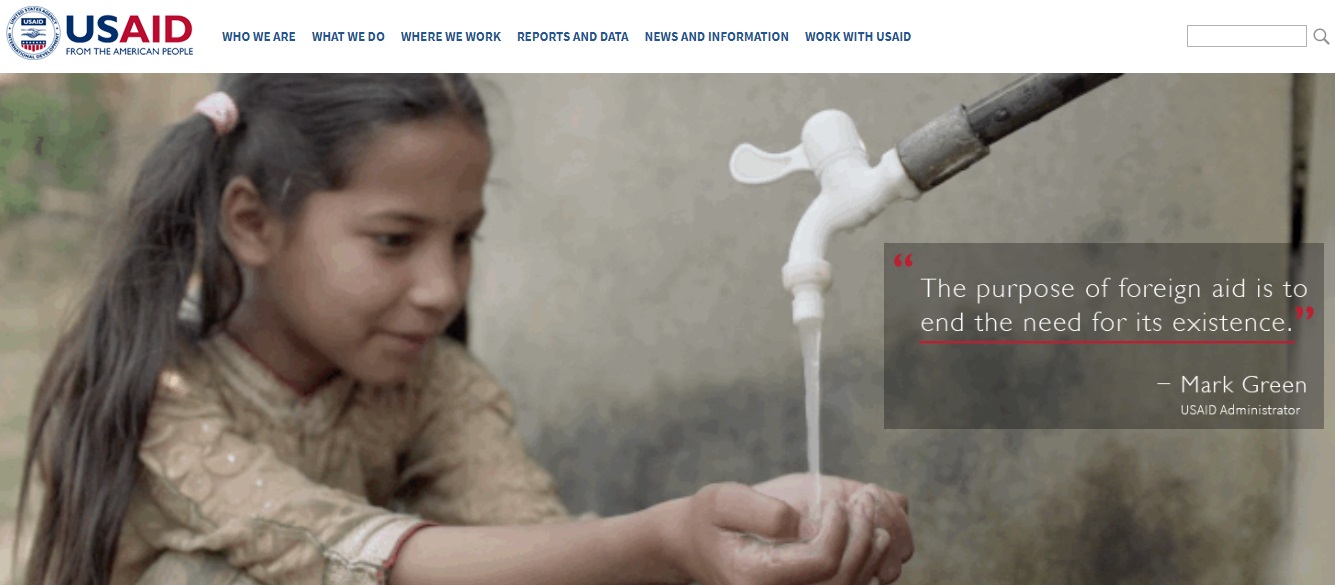
Choose images that emotionally and visually connect with people. Go for real photos featuring real beneficiaries. It is advisable for you to visit the field and interact with volunteers and beneficiaries to shoot photos that tell compelling stories. Take for instance the nonprofit Too Young to Wed. It does away with lengthy articles and white papers, and instead uses heartbreaking photos of child marriages.
Your design must be for social impact
Social impact design is one that seeks to solve humanitarian issues. The success of this type of design is measured by people’s experience and response, and not on what you (the designer) thinks has been accomplished. It is assessed for effectiveness, not just “delight”. Hence, the design for nonprofits must work where people might be using outdated devices and operate with poor Internet connections.
“Don’t just design to solve the problem; design specifically for your end users’ hardware, operating systems and operation environment,” said Brian Vanaski, creative director at design and software development firm CauseLabs.
Design tips every nonprofit graphic designer must know
There are nonprofit design rules that you can use even for commercial work. These are also applicable to print materials such as posters, flyers and cards. Here are some tips from the book Graphic Design for Non-Profit Organizations, published by the The American Institute of Graphic Arts:
- Typeface – Select one typeface to provide visual consistency. Sans serif suit technical texts or for organizations that go for a contemporary look.
- Type alignment – Generally, a ragged right setting is best because it has the advantage of uniform word spacing. For a tightly packed appearance, you can use the justified setting.
- Line spacing – A consistent line spacing is essential. Typesetting with no leading or 1 point of leading is recommended. A tight line spacing fits more type into a given area. You can use skipped lines to organize paragraphs.
- Paragraphing – Indicate paragraphs by skipping a line without indentation. If there are too many short paragraphs so that skipped lines take up too much room, paragraphs can be indicated by an indentation without skipping a line.
- Quotations – Set quotations in italics. If you are using quotation marks, hang the opening quote out into the gutter so that the first letter of the quotation aligns with the column edge.
- Highlighting and numbering – You can highlight points with bullets or an enumeration to maintain the crispness of the column edge. Bullets can be outdented and number or letters can either be outdented or placed in the line about the entry.
- Subheadings – Use only one clear signal for quotations. For instance, you can make a subheading bold (one signal) instead of bond + line spaced + different size (three signals). If one signal does the job, there is no need to use more.
- Letter Spacing – As type increases in size, space between letters must be decreased to maintain normal letter spacing.
- Logotype – Increase the nonprofit names identity by always presenting it in the same typeface. A less expensive and safer solution is to choose an existing typeface.
- Color – Color can help build a visual identity for a nonprofit. You can use color with a logotype to increase the consistency of the logotypes appearance.
The most important takeaway in this guidebook is the observance of consistency. By appearing in uniform, your website, content and printed materials visibly becomes part of a team that stands out from the crowd. “Consistency avoids arbitrary changes, allowing the meaningful cues to stand out in clear relief,” wrote authors Peter Laundry and Massimo Vignelli.
Are you aiming to increase awareness of your advocacy and boost donations? Do you plan to promote your volunteerism programs and fundraising campaigns? Your website design should help you achieve your conversion goals.Let experts guide you in designing for social impact. Contact ASSIST Creativelab today!